With my last post I had announced a change in the class schedule for the Memento Box at Peddler's Pack in Beaverton to October but sadly, must now reschedule for a date yet to be announced but tentatively scheduled for Spring 2012.
I always think I can get more into my life than I can, imagine that! So with Christmas, family and work obligations, I'm shooting for Spring and will announce an exact date after the first of the year.
In the meantime, look for more posts coming this fall of projects currently in the works!
Thanks for stopping by!

Sep 9, 2011


Jul 17, 2011
Memento Box
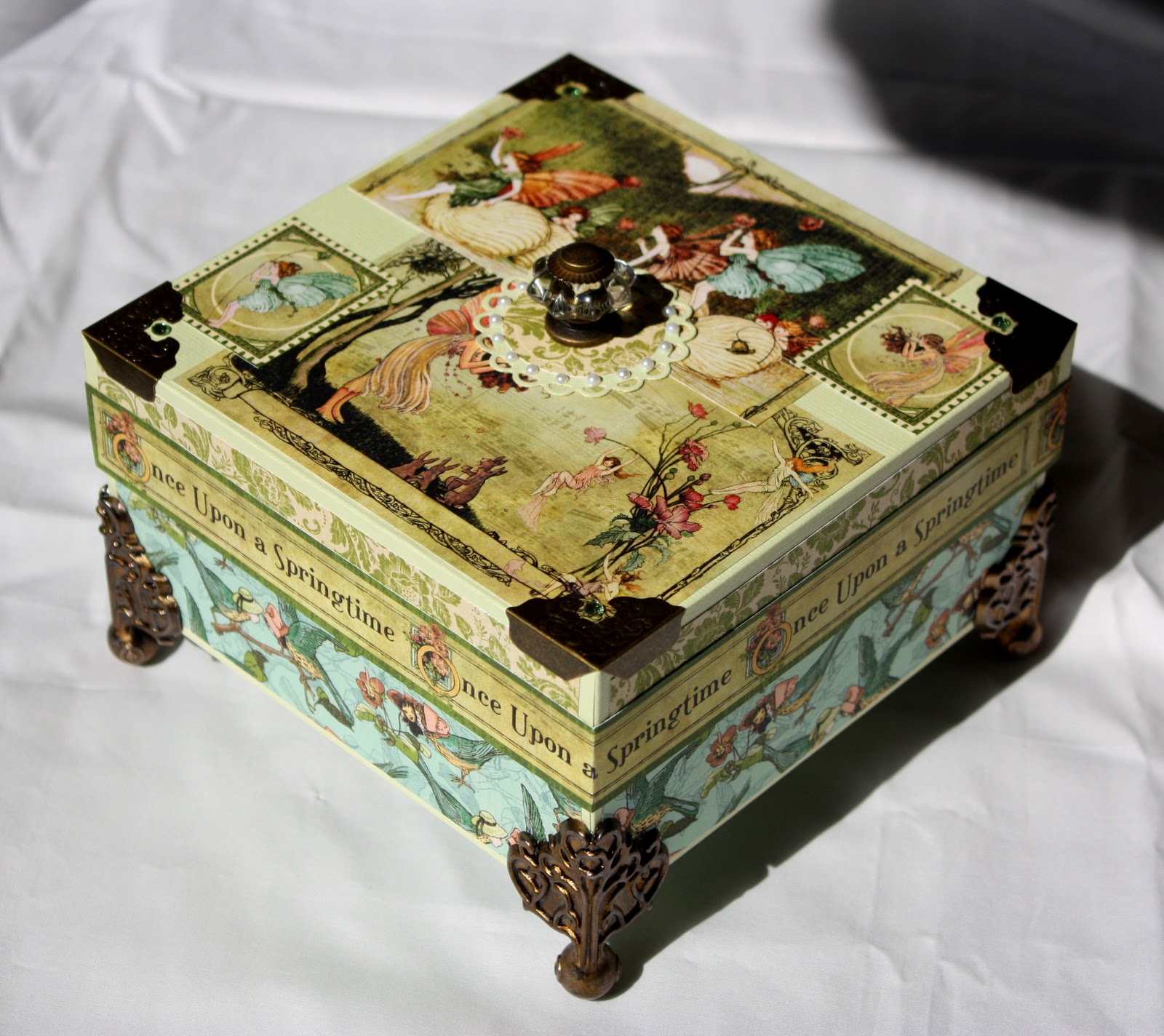
Thanks to Tim Holtz and Graphics 45, an ordinary box becomes something special! The possibilities are endless.

I wanted to create something special to commemorate the birth of my youngest daughter's first baby and decided the Graphics 45 paper I've had sitting for awhile was the perfect thing to use. Tim Holtz and his line of metal embellishments add that something "special" to any project and his elements are the ones I've used for legs, corners and the great knob on the top of the box. Add some tiny pearls around the Spellbinders die cut under the knob and there you have it!
By the way, this is NOT a purchased, unfinished box, it's built from scratch with a chipboard reinforced top and bottom.
By the way, this is NOT a purchased, unfinished box, it's built from scratch with a chipboard reinforced top and bottom.

Top detail.

Interior Detail.
As you're reading this, a class on construction of the Memento Box is being scheduled at The Peddler's Pack in Beaverton, Oregon sometime in late October. I'll keep you posted on details.
10/07/2011 Update:
Class has been postponed to Spring 2012. No point in driving myself crazy during the time I'm preparing for the holidays!
Mar 7, 2011
Weeds Are Growing Like Crazy

As promised, here is card number two in the series made as sets for Christmas gifts.
This was an engrossing card because I had no idea what I was going to do until it took shape during the creative process. That's always fun but I don't know why it also makes me nervous!?! I mean, it's only paper, which I have a ton of, and embellishments, powders and ribbons, which I also have a ton of, so what's the big deal? Somewhat the same feeling you get gazing at a blank sheet of watercolor paper and being afraid to apply the first color. It's an art thing, what can I say. Total neurosis, I digress.
O.k., this is my study in raspberry and tan. Don't blame me, Colormates says its raspberry and who am I to argue? Every once in awhile it's fun to do something unexpected and for me, throwing tan in with just about anything looks unexpected even though I usually like the results after the fact. What you're looking at here is a Colormates Medium Racy Raspberry base with a craft brown mat from my stash so I can't give you a manufacturer on that one. It's embossed with the ever favorite Cuttlebug Swiss Dots embossing folder leaving a l" blank area in the bottom half of the mat. This is where I was intending to emboss a greeting but decided to change my approach in mid-stream. Go figure.
Next up, here comes the Medium Racy Raspberry again, using Spellbinders Fair Isle Pendant die studded with jewels in the four corners. On top of that I applied ribbon from Joann's and one of the treatments it always tickles me to use which is finding ribbon that matches one of my stamps! See the Poppy Boxed Set post http://craneislandcomforts.blogspot.com/2010/02/poppy-boxed-set.html and you'll find a card that illustrates this same treatment. Thank you Joann's for cooperating with my desires, that's very sweet!
The focal point is a Spellbinders Large Classic Oval using the #4 die and craft brown paper, also embossing with the same die. The stamp is Stampendous "Weeds" (hence the title of this post, sorry) embossed using Versamark ink and fine white detailing powder. Here's my take on white embossing powder. After holding up numerous brands side by side in the jars, white is not always white. Most of what I've seen is actually off-white and while this might seem like nit picking, when you've spent all of this time and sweat, yes sweat, on a card and the white embossing looks as if the bleach got left out of the wash, well, you get the picture. The whitest white embossing powder I've ever been able to find is from "The Peddler's Pack" in Beaverton, Oregon. They must buy in bulk and repackage it in their own containers but honest, it is WHITE. They have a web site and the owner, Joyce, is always happy to answer any questions, she's is a real delight to speak with on the phone. Remember the beautiful witch in The Wizard of Oz? That's what she sounds like, honest! Love you Joyce. . . .
So, all of this is finished off with three little itty, bitty pearls centered under the oval. I've used water-marked bond paper to line the inside of the card but didn't include a picture since who wants to look at white paper anyway? Hey, not me, I'm still o-zoning on the blank white watercolor paper! Can anyone recommend a good therapist?
Thanks for visiting, oh, and putting up with me!
Feb 27, 2011
Poppies, Poppies, Poppies


I'll be posting a series of cards I made as Christmas gifts for family this last holiday season. The cards were combined as a set of twelve in a very simple, upholstered box constructed for the dimensions of the twelve cards. The color scheme for each box was chosen with the particular individual in mind.
Initially, I was designing a totally different box, much more complex, but after two months and 96 cards later. . . I revised my plan!
I'll be posting photos of the boxes at the end of this series to give you an idea of how choices in cardstock and pattern can make such a dramatic difference.
I'll also be posting the recipes for the cards as I go but of course, couldn't find my notes for this first one, poppies. Hope you enjoy anyway and keep checking back. . .or. . .better yet, "follow me" on my blog!
Apr 17, 2010
Split Negative Technique

Apr 2, 2010
Scrapbook In A Box
I'm posting this on a day we're expecting 85 mph winds here at the coast and a little over two years since we experienced the worst storm in almost 50 years. The "Once Upon A Time" scrapbook in a box shown below was created during that last big storm while we were out of power for four days. The winds howled with gusts up to 130 mph and the noise was so terrible I blocked it out by setting up three battery powered booklights on stands and getting to work. I like to think the energy of the storm fueled my creativity during those four days!


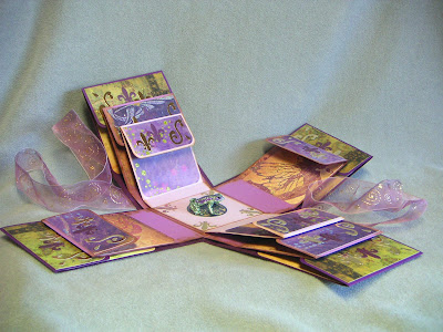


Once Upon A Time
Lid View

Without ribbon.

A scrapbook in a box is basically about 10 - 12 layers which fold together in order to create a box. Each layer is constructed to allow mounting of photographs or journaling.


This particular project was a commissioned piece and the individual it was created for loved frogs. So the "surprise" in the middle is a plastic frog detailed in Art Institute Glitter.

Flap detail.

More detail.

Detail, detail, detail.

Inside of the lid with signature. With these pictures, I'll never forget the date. So, as the winds pick up and while we still have power, I'm headed to my workroom!
Cheers!
Mar 13, 2010
Chatter: The Astor Hotel; It Was Fantasy In Pink

I'm not going to go into all of the historical details of this building, those facts and figures are available on numerous other sites I'm sure. What I want to tell you about is the coffee shop on the bottom floor that my dad would take me to on an occasional Saturday afternoon. And high up on the walls in colors of sea blue and green, magical and mythical creatures of the sea would swim non-stop. Amazing!
There is another memory I associate with the Astor Hotel, this one is related to a friend of my mother. This woman was larger than life to me, similar to a Lucille Ball image without the Lucille Ball persona. She was tall and statuesque with flaming red hair, long red nails and wore "Hollywood" clothes. She had a rather "scarlet" reputation in our small, 1950's town and I thought she was marvelous. In between husbands or boyfriends (is it really important?) this friend of my mother actually lived in the hotel. This seemed very glamorous to me, living high up in this highest building in our very small town.
The other thing that always fascinated me about this woman (I'm being discrete here about names because even though it's been over fifty years, this is, and I'll say it once again, a very small town) was always tan! At least that's my child's memory. This may not strike many of you as so unusual what with the abundance of tanning salons, but "in those days" unless you lived somewhere where the sun was a common factor in your life, sun tans were pretty exotic. And here on the north coast of Oregon? Forget about it.
I ramble, sorry. The connection here between my mother, her friend and the then pink, Astor Hotel is this.

Do you see the balconies located in the middle of every floor? The ones on the south side of the building got most of the sun and my mother's friend would often tan herself on the balcony at the end of the hall. I remember walking down the street with my mother one particularly warm afternoon and looking up at this exact side of the hotel (remember, think PINK) and there, barely in view, was someone sun bathing! My mother would call up to her, she wasn't on one of the highest floors, and her friend would poke her head to the railing, wave hello, they would exchange a few words, and off we'd go down the street.
So now, all of these years and so much living later, when I pass by this wonderful building on my way to this or that, I flash back and think pink. I also think glamour and spirit and spunk. But then, that's another story.
Subscribe to:
Posts (Atom)
