Mar 13, 2010

Chatter: The Astor Hotel; It Was Fantasy In Pink

My first memory of this amazing place is situated in the late 1950's, probably around 1958 to be exact.  In "those days" the hotel was painted a rather vivid shade of pink and to a child's eye, this was a very appropriate and exciting color!  So view the picture above and imagine PINK! The John Jacob Astor Hotel, locally known just as "The Astor", was then and is now, some fifty years later, the tallest building in Astoria.

I'm not going to go into all of the historical details of this building, those facts and figures are available on numerous other sites I'm sure.  What I want to tell you about is the coffee shop on the bottom floor that my dad would take me to on an occasional Saturday afternoon. And high up on the walls in colors of sea blue and green, magical and mythical creatures of the sea would swim non-stop.  Amazing!

There is another memory I associate with the Astor Hotel, this one is related to a friend of my mother.  This woman was larger than life to me, similar to a Lucille Ball image without the Lucille Ball persona.  She was tall and statuesque with flaming red hair, long red nails and wore "Hollywood" clothes.  She had a rather "scarlet" reputation in our small, 1950's town and I thought she was marvelous.  In between husbands or boyfriends (is it really important?) this friend of my mother actually lived in the hotel.  This seemed very glamorous to me, living high up in this highest building in our very small town.

The other thing that always fascinated me about this woman (I'm being discrete here about names because even though it's been over fifty years, this is, and I'll say it once again, a very small town) was always tan!  At least that's my child's memory.  This may not strike many of you as so unusual what with the abundance of tanning salons, but "in those days" unless you lived somewhere where the sun was a common factor in your life, sun tans were pretty exotic. And here on the north coast of Oregon? Forget about it. 

I ramble, sorry.  The connection here between my mother, her friend and the then pink, Astor Hotel is this.


Do you see the balconies located in the middle of every floor?  The ones on the south side of the building got most of the sun and my mother's friend would often tan herself on the balcony at the end of the hall.  I remember walking down the street with my mother one particularly warm afternoon and looking up at this exact side of the hotel (remember, think PINK) and there, barely in view, was someone sun bathing!  My mother would call up to her, she wasn't on one of the highest floors, and her friend would poke her head to the railing, wave hello, they would exchange a few words, and off we'd go down the street.

So now, all of these years and so much living later, when I pass by this wonderful building on my way to this or that, I flash back and think pink.  I also think glamour and spirit and spunk.  But then, that's another story.


Feb 28, 2010

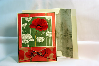
Poppy Boxed Set

Did I mention before I've become hooked on making these boxed sets? Well that hasn't changed!  I completed another last week and here it is.  Hope you're not tired of looking at these because I'm sure there will be a few more.  Here goes!


Outside of box with lid on. 
Sorry, I have a huge need to state the obvious.
I'm working on it though.


I'll bet you can't guess what this is. Yep, you got it.
Inside of box with lid off.
I said I was working on it.

A couple of things seriously. . . The set of six cards in the rear section of the box are the largest (I thought that was fitting) and are standard A2.
The mid-size cards at front left measure 3 1/4" x 3 3/4" and the little cards at the right front are business size note cards.

The transparent pocket on the front flap contains envelope seals on sticker paper so they're self adhesive and match the set.  These are an optional use item as all three envelopes are self-adhesive.

Here are detail pictures of each:


The A2 card has a top fold and the envelope is purchased then lined to match the set.


A little closer view.


Mid-sized card with hand-made envelope.


The little, business sized card with hand-made envelope.


There are some things to note.  The business size note card was embellished with heavy weight patterned paper using a Martha Steward border punch.  While I love Martha's punches they are not up to the task on heavy papers and card stock on the highly detailed punches.  In this case since I used paper with a white back and core, I was left with very "furry" openings which required sanding with very little tools and my craft knife to take out boulder (just kidding) sized pieces.  I quickly grew tired of this process and became less picky. Click on the image and you can really see, yuk!  This is not, I repeat not, a combination I would use again.

Also, since I used darker cardstock with the exception of the A2 card, I've lined all three sizes of cards with a nice watermark bond typing paper with a nice finish.

So, there you have it.  Any questions?  Don't hesitate to drop me an email and I'll get back to you promptly.


Feb 27, 2010

With A Little Help. . .

Got my question answered and fixed the tabs on the left!  (I'm waving my arms in the air!)

Comment To: Copy and Paste craneislandcomforts@msn.com

Feb 26, 2010

New Look

02.26.2010

At last!  A new look for my blog but I'm still working on getting rid of a few things.  Like what's with the "undefined" stuff hanging out on the left hand side of the page?  I'm a newbie with some of this stuff so hang in there while I get all of the kinks out. . . please?

I'm also working at being somewhat (that word gives some wiggle room) more regular with posts and expanding into other areas of interest.

Photography for one.

While the rain is coming down here and no, it doesn't always rain in Oregon, here's hoping you're not one of those people stuck in the snow and cold temps that have been relentless in so many areas of the country. 

Comment to: copy and paste craneislandcomforts@msn.com 

Jan 11, 2010

The Reveal

Currently I'm obsessed with making card sets, a total of three sizes in a set, all enclosed in a box to match.  I'm having tons of fun with these, afterall, isn't that the point?  A favored few got them for Christmas presents and I'm still not tired of making them!  So here's a few, enjoy!


The largest cards have envelopes which are lined with the black on white design paper.

And Another!


Just a note:  The area in the front middle of the front flap is a transparency pocket with punches mounted on sticker paper to be used as decorative closures on the back of envelopes.


And the last design!


Sep 17, 2009

Digital Design - Hard Copy Recipe Book


I've been playing with digital scrapbooking over the past several months and found a great opportunity to create a family recipe book for my daughter's wedding. After gathering recipes from family members along with photos for each, I used Photoshop Elements 7 and put together a pretty good selection. I used .png and .jpeg file elements from all over the internet but my favorite source continues to be http://scrapgirls.com. The site offers an incredible selection of the most beautiful elements.
Because I'm not very skilled at this point, the project was time consuming but I was pleased with the results and glad I undertook the project. I also learned so much during the process and that was a major plus! I've posted three of the cards above. Because of the 4 x 6 inch format, it was so easy to print everything on photo paper, slip them into 4 x 6 sheet protectors and create a cover which I then bound with my Zutter. Unfortunately, I didn't stop to take pictures of the finished product, perhaps I'll get a chance to post that later. I'm already thinking about creating a full set of all of my favorite recipes with one central design theme! O.k., another project on the list of so many! Another added bonus was the fact I burned a disc with all of the individual recipe files and included that with the bound book so my daughter can share if she wants!
If you haven't investigated digital scrapbooking or hybrid scrapbooking, check it out, you'll be amazed.


Jul 22, 2009

The Inside - Better Late Than Never!


"For all the frogs you've had to kiss, you've finally found your prince!" That's how the petals read in gold calligraphy pen with a plastic frog covered in Art Impressions glitter.


It's taken over a year to post these promised pictures but here they are. I'm back to my blog but will be making some major changes in design and content. Hang in there, knowing me, this might take awhile!


Powered By Blogger

Recent News

Translate

Search This Blog