The nautilus shell on the left and the stag beetle on the right are mine! So much fun to see this. The other artists and myself are credited in the little tiny yellow box about two thirds of the way down on the right edge of the cover. You'll have to zoom in to see it but it's there! Ok, I'm done bragging, thanks for stopping by!
Jul 24, 2017
Bragging Rights!
The guys down at our locally owned art supply store Dots and Doodles Art Supply, Scott and Tim, stock a very nice line of spiral bound sketchbooks with covers featuring local artists. I submitted artwork quite awhile ago and basically forgot about it. I was in the store last week and saw my own art staring back at me!
May 22, 2016
Hello Friend
"Hello Friend"
5" x 7" Top Fold Greeting Card
Blank Inside
The "Hello Friend" greeting card was extra fun to make probably because of the unique die from Cheery Lynn Designs. The die information is "Screen Door with Cat" #A2164. I chose to use real birch wood veneer for the screen door.
As the wood is very, very thin, there is no problem cutting the image. The die actually comes packaged with 2 pieces of screen and extra screens are available through the site. I took a look at our local Home Depot store and found this gauge of screen available by the foot. Since I usually do produce several of any one given card design, Home Depot was a good way to go for me, bringing the cost down considerably. To add depth and the appearance of an interior, a green and white striped patterned paper is used behind the screen and cat. While this addition looks fairly simple, there is a trick to layering all of the pieces securely to the reverse side of the door. I used 1/8 inch score tape and adhered each layer separately.
Estate Fence die #98285 by Memory Box is utilized to give the background some interest. I attempted to find this die on the website's product index and it looks as if it is no longer available. Not to worry, I have seen many variations of the estate fence available through most of the popular companies offering paper crafting dies.
Last but not least is the greeting "Hello Friends" from the Cuttlebug Friends Forever Embossing Folder and Dies. I had a difficult time locating this set but finally found it on an Etsy site and you can get there from HERE.
All cardstock used in the card is Bazzil Bling which has a pearly shimmer not picked up well in this photo and the base is Hammermill 100# Digital Color Copy paper.
Oh, almost forgot, I chose a Swarovski flat back crystal to dot the "i" on "friend". That should do it.
If you don't want to duplicate "Hello Friend" yourself, there will be six available later in my Etsy store at Crane Island Comforts on Etsy.
Thanks for stopping by!
May 15, 2016
Spotlight on Artist Mica Still
Napier, New Zealand
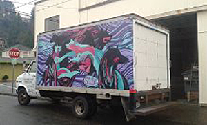
Mica Still, a fabulous artist currently living in New Zealand, is known for her outdoor street art and she works BIG! Formerly a resident of Astoria, Oregon, Mica (known as Michelle locally), is the daughter of Nickie Piippo. Nickie is the past owner for many years of Paper Moon, a local paper arts store. So as one might see from the images above and below, artistic talent runs in the family.
The wall in the picture above depicts the current crisis of the oceans' inhabitants becoming entangled in abandoned fishing nets and other debris which usually leads to death. Mica was among a select group of artists invited to participate in this world wide awareness project with this focus displayed in Napier, New Zealand.
While Mica was here in Astoria for the holidays a few months ago, she was asked to create a mural on a truck owned by her uncle's construction company. It was my great pleasure to be able to see Mica at work. With her only tool being artist quality spray paints she purchased locally from Dots n' Doodles Art Supply, Mica set to work on a very cold winter day. And...
this is the result of her efforts!
We are amazed with Mica (Michelle) and her body of work done on an international scale. She's one Astoria can be proud of!
Apr 19, 2016
Robin's Heart
Robin's Heart was a project of love for my sister Robin. Hearts are one of her favorites and the feather represents our mother who passed away several years ago. Please excuse the background shine, I neglected to take a final photo before I had the piece matted and shrink wrapped in preparation for shipping.
I'd like to share the process of how this came together for those who are interested.
The tangle I used to morph into a heart is "Grace" by Helena. It's a tricky little beast! All I can say about the pattern is to tackle two or three hearts in the chain at a time to achieve the 3-D effect. I started this one twice to get it right. I used a Micron .01 to draw the hearts after first drawing a penciled in heart shape first.
This photo shows the pattern completed with color, shading and highlights added. I used my favorite colored pencils, Caran d'Ache Luminance colored pencils. They really take the color layers beautifully without a waxy bloom. Seven colors were used so achieve the dominant color and shading. You can see the feather design sketched in the middle getting ready to add color.
Feather has been added and now we're ready for the background!
Concentration! The tangle pattern used for the background is "Y-Ful Power" by Soshi. Click on this link for the step-out. The pattern is started with an offset grid drawn in pencil. If you look at the step-out this will make more sense. I drew the entire grid in pencil first and then started the pattern, only doing one small section at a time. Again I used a Micron .01 for the pattern lines. Next came the shading, I use a 4B graphite pencil and a paper blending stub for detail. For the shadow I still went for a 4B but applied a much denser layer of graphite before blending.
So there it is! I'd be happy to answer any questions about this piece or tangled inspired art in general, just leave me a comment and I promise to get back to you.
Thanks for stopping by!
Aug 19, 2014
Nautilus
Mixed Media
21 x 15"
Strathmore Smooth Bristol Board
This is a piece I recently completed with the hopes of gaining more experience with colored pencils. This is a new medium for me even though I purchased Faber-Castell Polychromos some time ago and added Caran d'Ache Luminance pencils for this project, I have completed only one other piece and used a very limited palette. I really wanted to practice layering and shading and include other mediums in the mix.
Because this was more about color application and I didn't want to think about design, I dowloaded one of Ben Kwok's wonderful templates from the Facebook Ornation Creation group page and enlarged it at a local print shop. The image itself measures 15 x 11". I found out this was quite a bit of real estate to cover, this took about 45 hours to complete!
Detail of center.
Detail of Golden Interference Orange Fluid Acrylic Paint
The interference paint in some areas really made things pop. From one angle the paint appears orange and from the opposite angle it appears teal. The little ovals all around the edge and the swirl in the center were painted with Golden Iridescent Copper Light. This photo also shows the need for mastering the waxy bloom of layering colored pencils. Even with the use of Gamsol between some of the layers, my heavier dark color application at the end produced bloom. Gotta work on that!
Speaking of layers,the following shots show the progression of color application which began with a light wash of Daniel Smith Hansa Yellow Light watercolor and then worked up from there with the Caran d'Ache Luminence colored pencils.
Thanks for stopping by!
Mar 16, 2014
NATALIE'S GOLDFINCH
![]() |
| NATALIE'S GOLDFINCH 14 X 17" On Bristol Vellum Colored Pencil , Ink , Graphite & Gold Leaf |
This piece was a request from my daughter for my grand-daughter's birthday in May. It was also my first experiment on Bristol vellum with colored pencils. I love working with the Faber Castell Polychromos, layer upon layer of shading and texture. It's a workout on the hands though! Micron pens .05 and .01 were used on the ribbon. The ribbon was a challenge, I actually had about eight hours into this piece before I put it aside and started over from scratch. The ribbon was just not working and there are a few things I learned in the process that I will put into practice when I include a tangled ribbon in future projects. Helen Williams' e-book available on her blog A Little Lime, was a tremendous help.
All shading outside of the ribbon, "N" and goldfinch was done with 2B, 6B and 8B graphite pencils and a paper stub. One thing I'd like to pass on and which was new to me; when using a blending stub it's good to sand the end frequently so the colored pencil doesn't build up on the end of the stub making blending of the graphite far more difficult. I couldn't help touching the edge of the colored pencil area as I was adding my shadows and noticed problems as I tried to blend the graphite.
Lastly, I just had to add some gold leaf in a few spots and was very happy with the outcome. Another word of caution about the gold leaf sizing on paper. Give it plenty of time to dry! If you smear it outside of the desired area you get to spend some really anxious moments gently removing it from the paper with an Xacto knife!
Thanks for stopping by!
Feb 9, 2014
Zendala Dare #88
Zendala Dare #88
This is my first completed Zendala Dare; template is available through The Bright Owl. The templates are outline zendalas ready to download, print and tangle. I think the most amazing thing about this process is the zendala you start with sometimes ends barely resembling the original. And the tangles create the magic with color placement.
If you compare the original template #88 from The Bright Owl, you can see the dramatic difference just in the addition of three tangle patterns with the picture below.
There are only three tangle patterns used here; Paradox, Girders (used in the center) and a fan type fill I used at the top of each segment. Paradox is available here on YouTube. Paradox provides many varied and interesting results based on the shape you start with. If this statement sounds confusing, watch the video and it will become more clear. I started thinking I was going to apply color in a certain way and when I set the piece down and then walked by it later, the sections popped out at me in a completely different way. So that's what I went with.
After printing the zendala outline on an ink jet printer, I used Canson semi-transparent marker paper as an overlay and traced the zendala in non-photo blue pencil. After all of the tangle patterns were added I photo copied the piece onto Xpress It Cardstock (specifically made for Copics) and added my color. I also applied the same color technique to the Canson which works very nicely and saves a photocopy step. Both papers are great with inks.
Color was applied with Copic markers: R22, R24, R29, BG10, BG13, BG25, V12, V15, V17, YR21, YR23, YR24 with warm grays in W1, W3, W5 and W7.
Tangles patterns drawn with a Micron .01 pen.
Thanks for stopping by!
Jan 29, 2014
Ikea Kitchen Carts for Your Studio
The Raskog Kitchen Carts available at Ikea are fantastic movable storage for your work area or studio. I've been asked about these so many times, most recently on Facebook, that I thought I would show everyone how I use them and how fantastic they are.
The photos below are close to a year old and since then I've added a wooden table (and lots of other stuff) to my studio, replacing the Costco folding table I worked on for years. The carts work great alongside both setups.
This is a photo of the "dry" work area of the studio and the floor is carpeted. The carts roll around with no problem, even fully loaded.
The hanging containers really serve to expand the storage of these carts and can actually be hung on all four sides and all three levels. Here's a link to one of the styles I also found at Ikea in the kitchen gadget area. They are so inexpensive you can really go wild!
I live in a small coastal town on the Oregon coast and its a two hour drive to Portland and the nearest Ikea. So a friend of mine and I took orders from our friends and did a road trip to Ikea one Saturday last winter. We came back with a car full of carts!
Thankfully all of this is available online but we figured our fuel and lunch would cost less than the shipping!
Since establishing a "wet" area in my studio, I've moved one of the carts beside the easel so it now holds only paints, brushes and mediums. I'm thinking I need a third cart to fill the space I moved this one from. Yes?
Thanks for stopping by, if you have any questions, leave a comment below.
Hugs!
Jan 28, 2014
Tangled Peacock Moth
Tangling and Copics, that's been so much of what I've been doing lately. All I can say is it's so much fun to see things take shape and I just want to start another!
Ben Kwok posts such beautiful blue line templates on Facebook that adding the interior design with tangle patterns and then color application with Copic alcohol markers provides so many creative avenues. So here is the moth template with a few design changes of my own. I continue to want to give a peacock feel to everything, I hope the moth doesn't mind the cross breeding! I'm still experimenting; I've used the micron pens in 01, Copic alcohol markers, graphite pencil and a glitter brush on Xpress It card stock. That's about it. I need to take a break and get back to my watercolors soon. Well, maybe one more tangled template.......
Sep 6, 2013
PHYLLIS WITH TWO I'S - EYES!
Meet Phillis!
That said, the request was made for natural colors so I started with a latte colored, handmade pastel paper. It presented some challenges because of the softness and texture but in the end I enjoyed working with it. I used mostly an 05 Micron pen for the tangle patterns and an 08 for all of the outlining. This is by far the largest piece I've completed using tangle patterns; the outlining and letters alone took seven hours.The piece finished up at 16 inches square or there about and I finished the edges with a deckle edge pair of scissors. Phillis (the picture) is at Staples as this is being posted, waiting for lamination. I thought about all kinds of different all-weather coatings and finally ended up with lamination. The finished piece will be adhered to plywood, sealed and hung on the new house.
I had an enormous amount of fun working on this and it's spawned a whirlwind of nature images in my head. I best go feed the beasties!
Thanks for stopping by!
Jul 28, 2013
LIMITED COLOR CELTIC #31
I posted this same Celtic knot last week which had Copic alcohol pens applied to the entire piece. This week I wanted to try the same knot with a limited amount of color to see what the results would be.
I used a cobalt turquoise #153 Faber-Castell PITT pen for the blue which turned out to be a good choice. The reason being when I shaded with my Copics, the blue did not move at all when the alcohol pens were applied on top. Had I used Copics for the blue I probably would have had issues adding the shading in grey.
The shading was done with Copics W0, W1, W3 and some W5.
Thanks for stopping by!
Jul 23, 2013
CELTIC CHALLENGE #31
The above Celtic knot is offered up in answer to Judy West's Celtic Knot Challenge #31. I'm not submitting this piece because it does not comply with the parameters of the challenge in that each and every section had to contain a different tangle pattern. I just couldn't bring myself to put 36 patterns in this one piece, I have no courage. So I used a wee 6 tangle patterns and some color and this is what I got.
The piece measures 8 x 8 inches, was drawn on X-Press It card stock for alcohol pens and I used my Copic markers for the color application. Then things sort of went sideways when I decided to use a graphite pencil to shade the intersections of the tangles instead of just sticking with my Copics. Don't know what I was thinking but lesson learned.
I still had fun with this technique, I'd never tried a Celtic knot combined with tangle patterns and it's the first time I've combined my Copics with tangling. All in all I'm glad I tried it.
Thanks for stopping by!
Jul 14, 2013
Tangled With Color
I've been caught up in Zentangle (a registered trademark) and tangling for the last two months or so and am absolutely enjoying every minute I spend on it. The world goes away and I love getting lost in the art.
If you're unfamiliar with Zentangle, Google it and you'll be amazed at the sites and blogs devoted to this unique art form. There's some really beautiful work being made out there.
I decided to start experimenting with color and have started a couple of larger Zentangle inspired pieces which are still works in progress. I've been using watercolor pencils and Copic markers up 'till now and applying the color and shading to the completed line art. However, I was inspired by Rosemary Hill, a Certified Zentangle Teacher, to use a different method and the three test pieces are shown below.
If you're unfamiliar with Zentangle, Google it and you'll be amazed at the sites and blogs devoted to this unique art form. There's some really beautiful work being made out there.
I decided to start experimenting with color and have started a couple of larger Zentangle inspired pieces which are still works in progress. I've been using watercolor pencils and Copic markers up 'till now and applying the color and shading to the completed line art. However, I was inspired by Rosemary Hill, a Certified Zentangle Teacher, to use a different method and the three test pieces are shown below.
This first and the following two pieces are 3 1/2 x 3 1/2 inch square tiles on Tiepolo paper.
I added splotches of Tim Holtz Distress Stain, misted with water and tilted the tile to let the color run where it would until I was satisfied. A light selective blotting with a paper towel and then drying with a heat tool provided a good start.
I didn't draw a string but let the segments of color determine where I would place the individual patterns and even what choice of patterns I made.
This turned out to be a lot of fun, I'm definitely going to be playing with this more!
***************
If you live on the north coast or plan on being in the area Saturday, August 3rd, our local art store, Dots N Doodles Art Supply will be hosting Rosemary Hill with two, two hour Zentangle classes, Zetangle1 and Zentangle 2. It's going to be a full afternoon well worth the time. The response to the classes had been exceptional and there aren't many spots left so if you're interested, give the site and their blog a look-see and then give them a call or a fast email.
Thanks for stopping by!
Trisha
Mar 2, 2013
A Peacock and A Poem
(Double click on any picture for detail)
I need therapy. That's what this is all about. I tend to create in very structured ways and I'm hoping art journaling will help me fix that. So with a new Ranger Industries Dylusions Art Journal designed by Dyan Reaveley and tons of ink, this is my first attempt, officially that is. I attempted a start in another journal and ended up using it to test new products, which is all good but the journal size didn't seem right, etc., etc. So as I said, this one is official!
Tim Holtz Distress Inks were used on the naked background with some ghosting technique and The Crafter's Workshop large peacock feather stencil. By the way you can find a great selection of TCW stencils at Dots N Doodles Art Supply in Astoria, OR if you live in my area or are ever visiting the Oregon Coast.
Next step was more stencils and more Distress Ink used in a misting bottle and mixed with water for the pebbles in the bottom left hand corner and a few of the peacock feathers. Then I sponge applied full strength ink through the small peacock stencil to create a flow of feathers across the bottom of the two page spread and up the right side to connect to the bottom of the peacock. The peacock was roughly inked in with a water brush and reinker.
A little stamping with archival ink across the top filled things in a bit. The poem is The Invitation by Oriah, I didn't have room for the whole thing, it's long, so I used the parts I like the most and a white Marvy Le Plume opaque pen to get it down on paper. Love white lettering but it's so difficult to find the perfect pen. They tend to clot, skip, and not cover well. I must own six or seven and have to struggle every time I use one. This attempt came out pretty much the way I envisioned so I shouldn't complain too much about white pens!
So there it is, I had fun and I'm ready to get all inky again very, very soon.
Thanks for stopping by!
Jun 10, 2012
Great Classes from Els of Elizabeth Craft Designs!
| Our group of happy participants! |
Two classes at two hours each were jam packed with technique and product and we were like sponges, taking in everything as quickly as possible. It was an afternoon and evening well spent. I think the last sentence is a huge understatement!
| Maggie, the product rep with Els |
Els demonstrating to the class.
Hard at work.
Janet breezed through and seemed to be having a great time, yes Janet?
Helen "Tootsie" Bagley Rund of Paper Bagley gets new ideas from the classes. This lady takes the basics and goes off in creative directions most of us are envious of!
My personal thanks to Els for coming to our "remote outpost" on the Oregon Coast, we appreciate your effort more than you know. You are welcome back anytime!
Dec 11, 2011
Alcohol - Pens That Is! Really?
Take a few very creative women, add great surroundings, lots of paper crafting supplies and tools, a generous supply of Copic and Marvy alcohol pens, shake and serve for a weekend of fun and productivity!
We focused on the Marvy and Copic lines of alcohol pens and the voluminous information offered to produce some really fantastic focal images for paper crafting projects. After getting a little practice under everyone's belt, we moved on to combining Elizabeth Crafts Designs and Glitter Ritz products using alcohol pen techniques for detailing. The result was extremely gratifying and oh by the way. . . we had a great time!
Becky and Terry showing off their first practice image.
Paula deciding a real cup of hot chocolate might be next!
Jeannette Hayward, owner of Scrapbook Connection
Here are a few works in progress:
We started at 10 a.m. Saturday, held class, had a great dinner in the well equipped kitchen, worked and played until 2 a.m., then fell, pleasantly tired into comfy beds all ready and waiting for us. I should say, I was in bed by by 2, I heard this morning at breakfast that the fun went on until 4a.m.! When people start creating with no distractions and great people to talk to and share with, it's difficult to stop!
With breakfast over it was back to the work tables, and me? I headed home to attack the laundry and take a nap!
And don't forget to follow me here!
Until next time, enjoy life.
Subscribe to:
Posts (Atom)


.jpg)

.jpg)
.jpg)
.jpg)
.jpg)